Scientific progress is rarely linear. Some ideas go out of fashion, only to reappear in a new guise later. Economic geographers know all about this, having seen their concepts of central places, regions, and cities suddenly revived by the New Economic Geography in the 1990s.
I had a similar adventure in my work on conflict. An indicator I thought was radically innovative turned out to be inspired by a conceptual framework developed in spatial analysis half a century earlier. This experience led me to believe that perhaps we are relearning to think about space because of a shared commitment to a scientific approach.
A new indicator
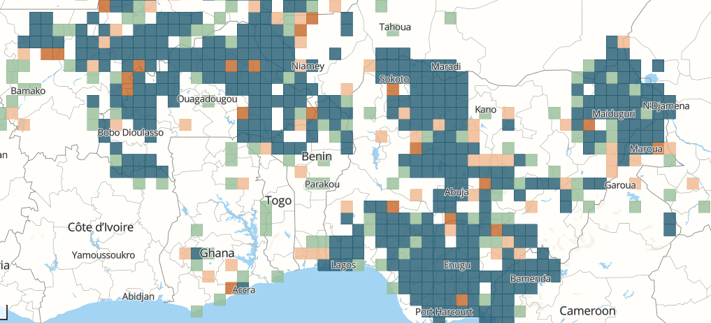
When I started working on the geography of armed conflict in Africa in the early 2010s, I noticed that political violence was very unevenly distributed. Some cities like Maiduguri in Nigeria had been attacked hundreds of times by violent extremist organizations over the last 15 years, while large swaths of the continent remained peaceful.
To better understand this geography of violence, I developed a new Spatial Conflict Dynamic indicator with Steven Radil and David Russell. The SCDi measures the number of violent events observed in a region and to what extent these events are spatially clustered near each other.
Combining the intensity of violence and its degree of concentration allowed us to identify four categories of conflict, according to whether violence is more or less intense, and more or less clustered spatially, as can be seen below.
The Spatial Conflict Dynamic indicator combining intensity and concentration.
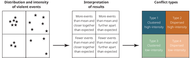
Mapping different forms of political violence is particularly important to civilian populations. If violence is highly concentrated spatially, then it is reasonably safe to live and travel anywhere except for a few hotspots. If violence is diffuse, most people will feel unsafe everywhere.
Our work suggests that different policies should be adopted depending on the type of violence observed locally. Regions where violence is very intense and very concentrated, like the Dogon Country in the Sahel, require different policies than regions in which conflict is lingering.
Back to spatial analysis
In developing this quantitative approach, I knew that it was inspired by spatial analysis, a trend that dominated human geography in the 1960s and has since been rivalled by other, more qualitative approaches.
Little did I know, however, that a very similar framework had already been published in the Proceedings of the 1972 meeting of the IGU Commission on Quantitative Geography by Rutgers Professor Arthur Getis in 1974.
In a paper entitled “Representation of spatial point pattern processes by Polya models”, Getis explained that spatial processes combine two dimensions: a spatial dimension that opposes diffusion to agglomeration, and a demographic dimension that opposes birth to death.
To visualize this combination, Getis used a tridimensional graph, which he called “an impressionistic representation of the spatial and demographic processes responsible for pattern change” in Models of Spatial Processes, published in 1978 with Barry Boots.
The horizontal axis (x) represents the diffusion-agglomeration continuum, while the vertical dimension (y) represents the birth-death continuum. Time is integrated through a third dimension, as can be seen below.
Getis’ framework for viewing spatial processes
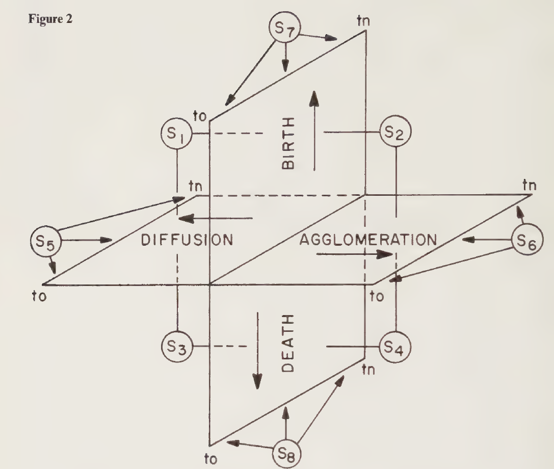
The combination of the spatial and demographic dimensions produces four processes, depending on whether x and y are positive or negative.
Contagion and relocation happen when births exceed deaths and diffusion tendencies are greater than agglomeration forces as in the S1 section. Industrial clusters are typical of the S2 section, where both birth and agglomeration are positive.
Conversely, a selection process is at work when both dimensions are negative, as in S3. Finally, S4 represents a decrease in the number of objects as clustering continues, a rather unusual process in human interactions.
Where do we go from here?
Getis did not apply his framework to armed conflict. His interest was much more focused on population and economic processes rather than violence, for which the SCDi was designed. This explains why Getis’ x and y axes can take both positive and negative values, while the SCDi only measures positive values.
I was not aware of the Getis diagram when we developed our indicator, yet we came up with a similar tool from a completely different starting point, that of conflict. This raises an interesting question: Does the convergence between our work and his confirm the relevant of spatial analysis or, on the contrary, the outdated nature of my approach?
I am obviously leaning towards the first option. If I can achieve the same results as Getis by other means, this can only strengthen the foundations of spatial analysis. I like to think that the two dimensions of the conflict indicator – intensity and spatial distribution – are the most synthetic expression that can be given to a complex set of events in space.
In other words, what I study in terms of conflict refers back to more general principles laid down in the 1970s in geography. So, there is nothing to fear from the repetition of ideas, but everything to rejoice in their application to new fields of research.
Acknowledgements
I would like to thank Steven Radil and David Russell, who developed the SCDi with me and provided crucial feedback on an earlier draft of this blog. The SCDi could not have been developed without the support of Marie Trémolières and the OECD Sahel and West Africa Club, which has supported our research for more than a decade.
By Olivier Walther, 4/9/2025.